DEF INVESTOR PRESENTATION
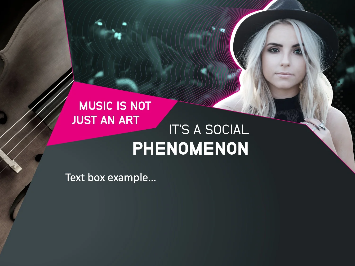
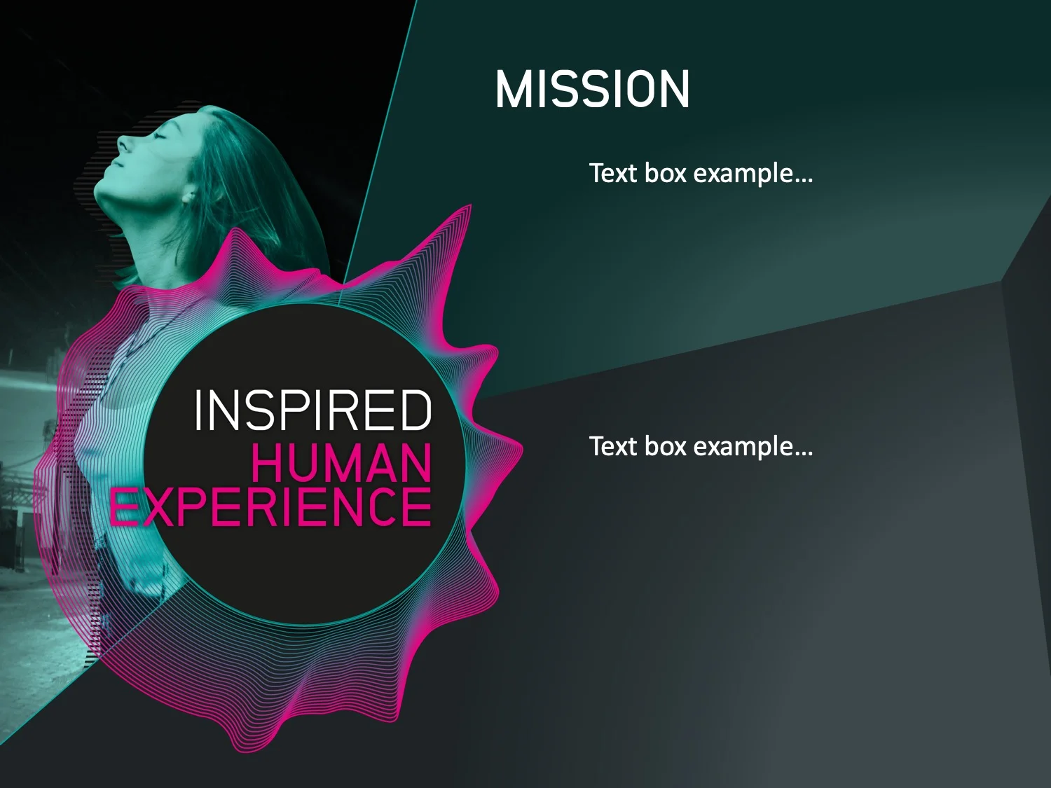
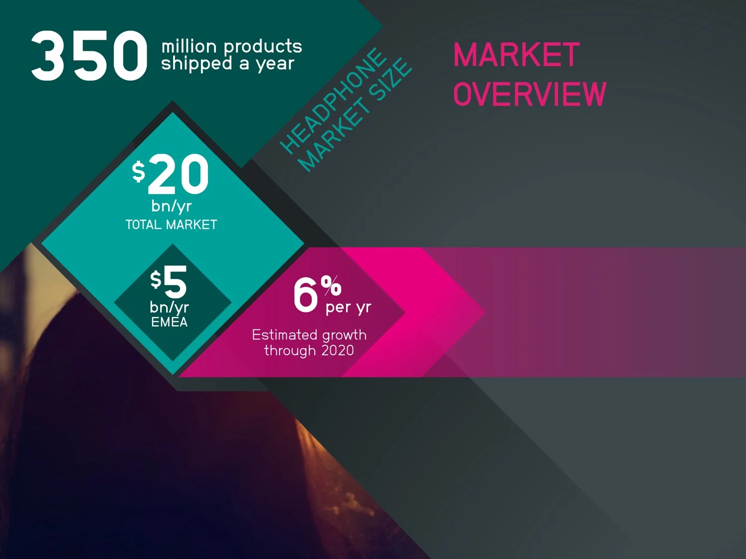
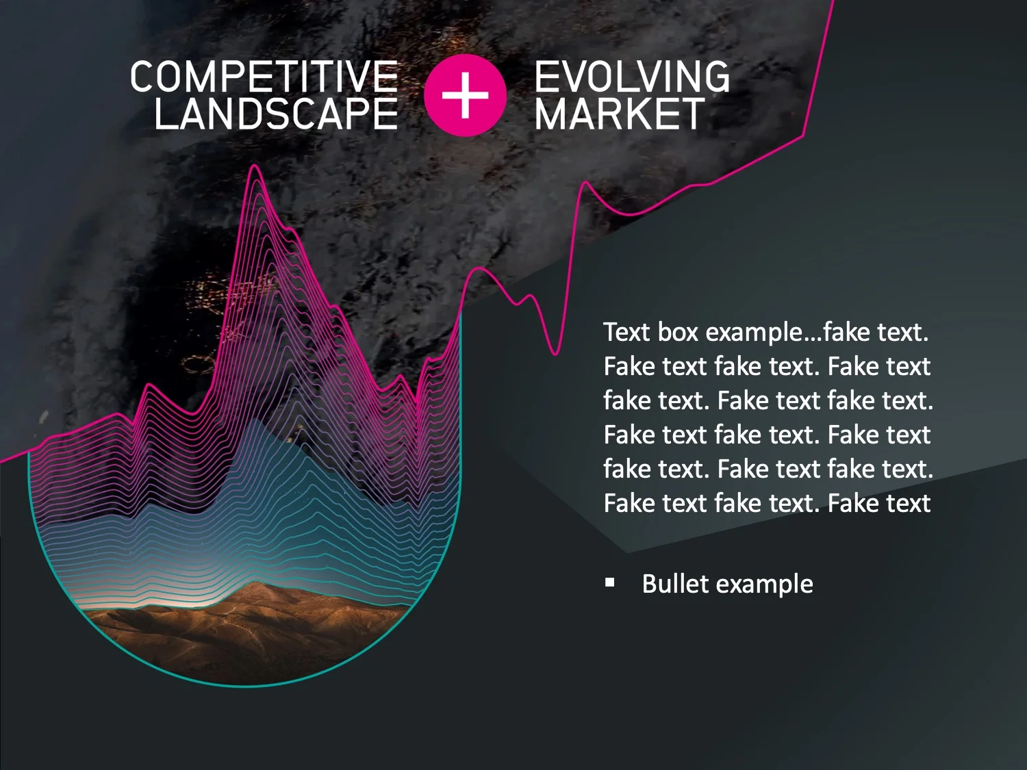
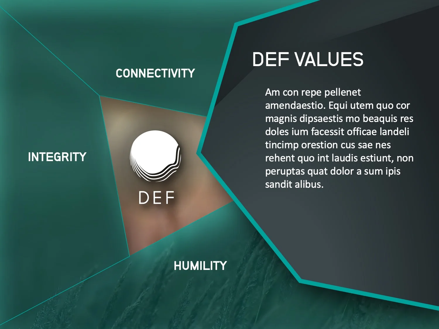
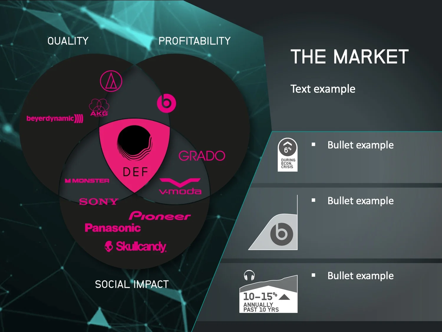
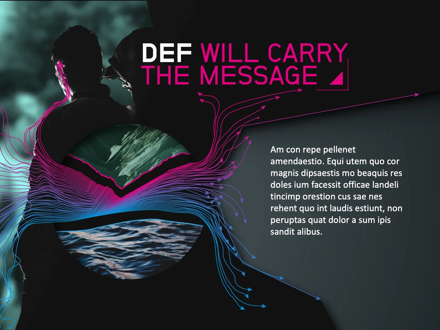
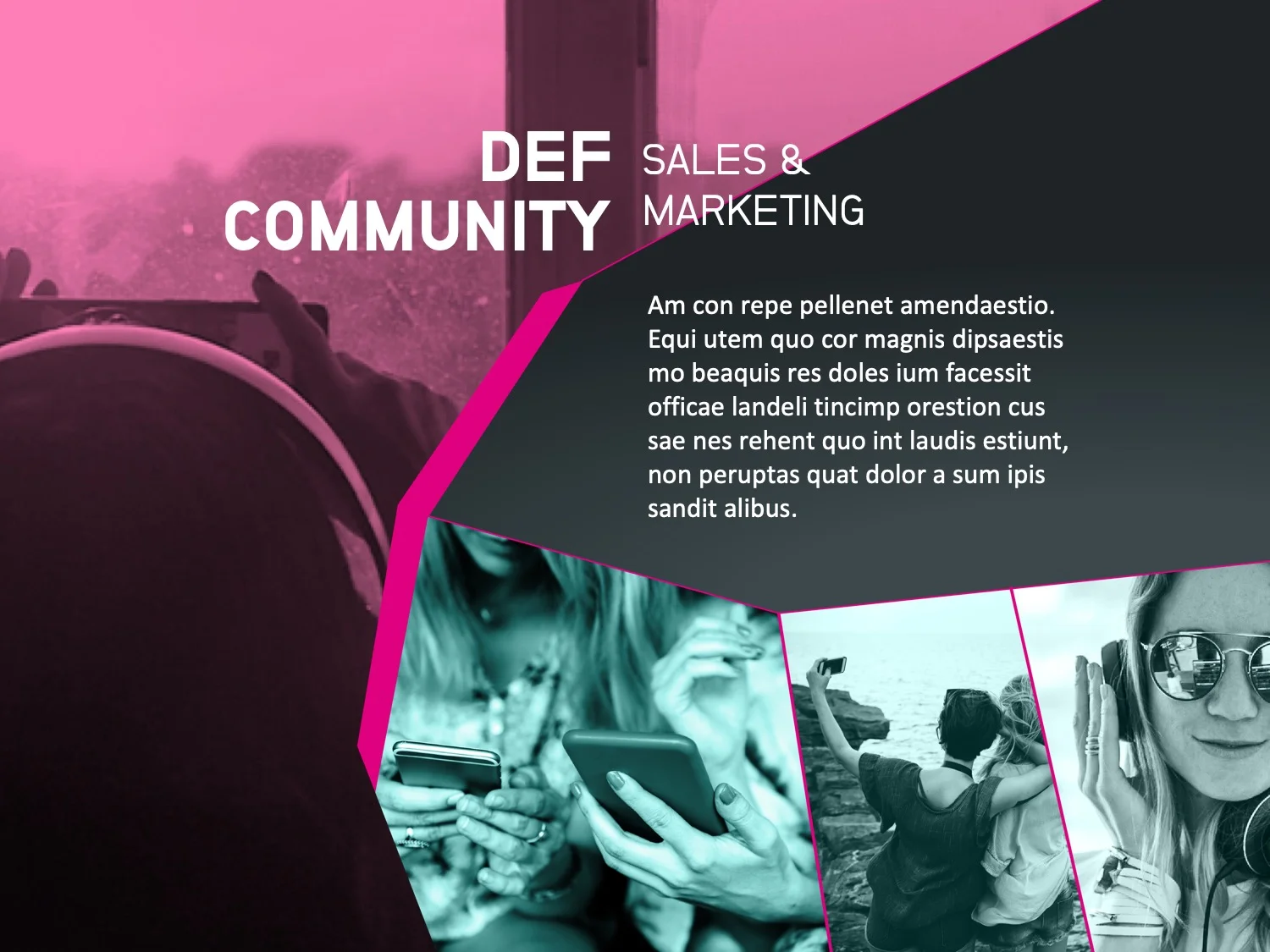
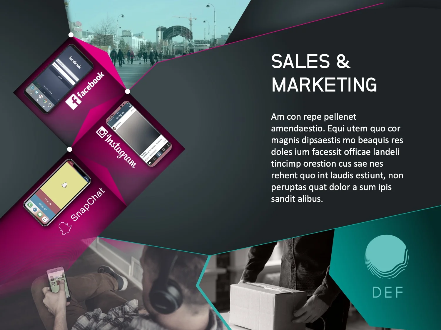
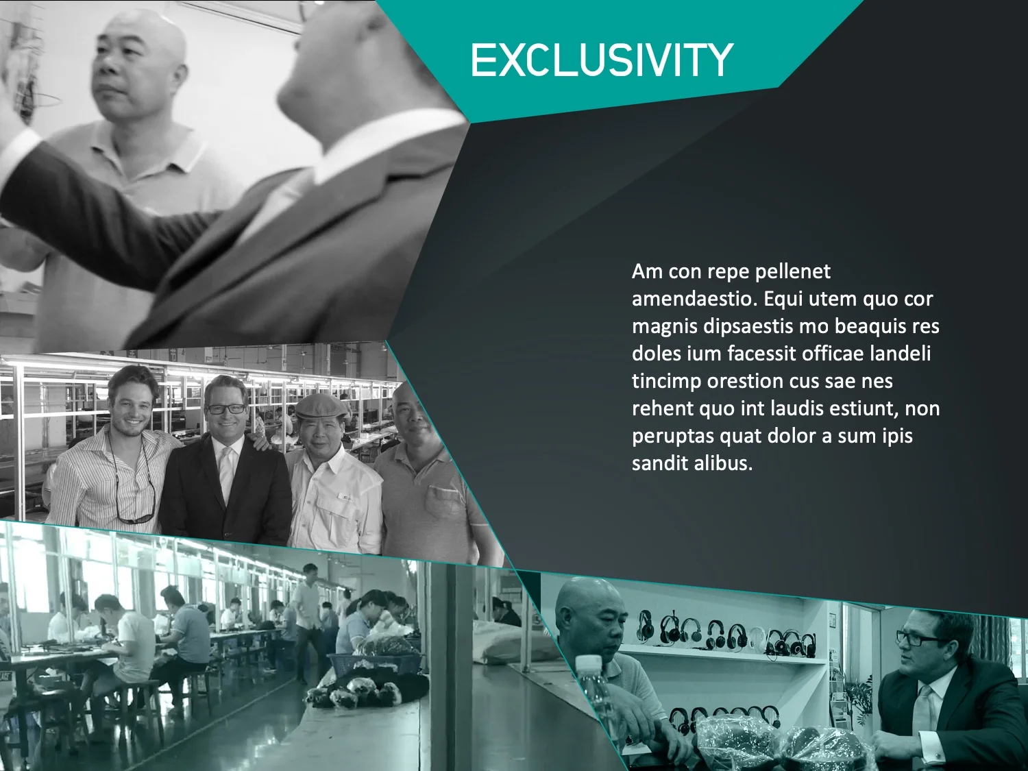
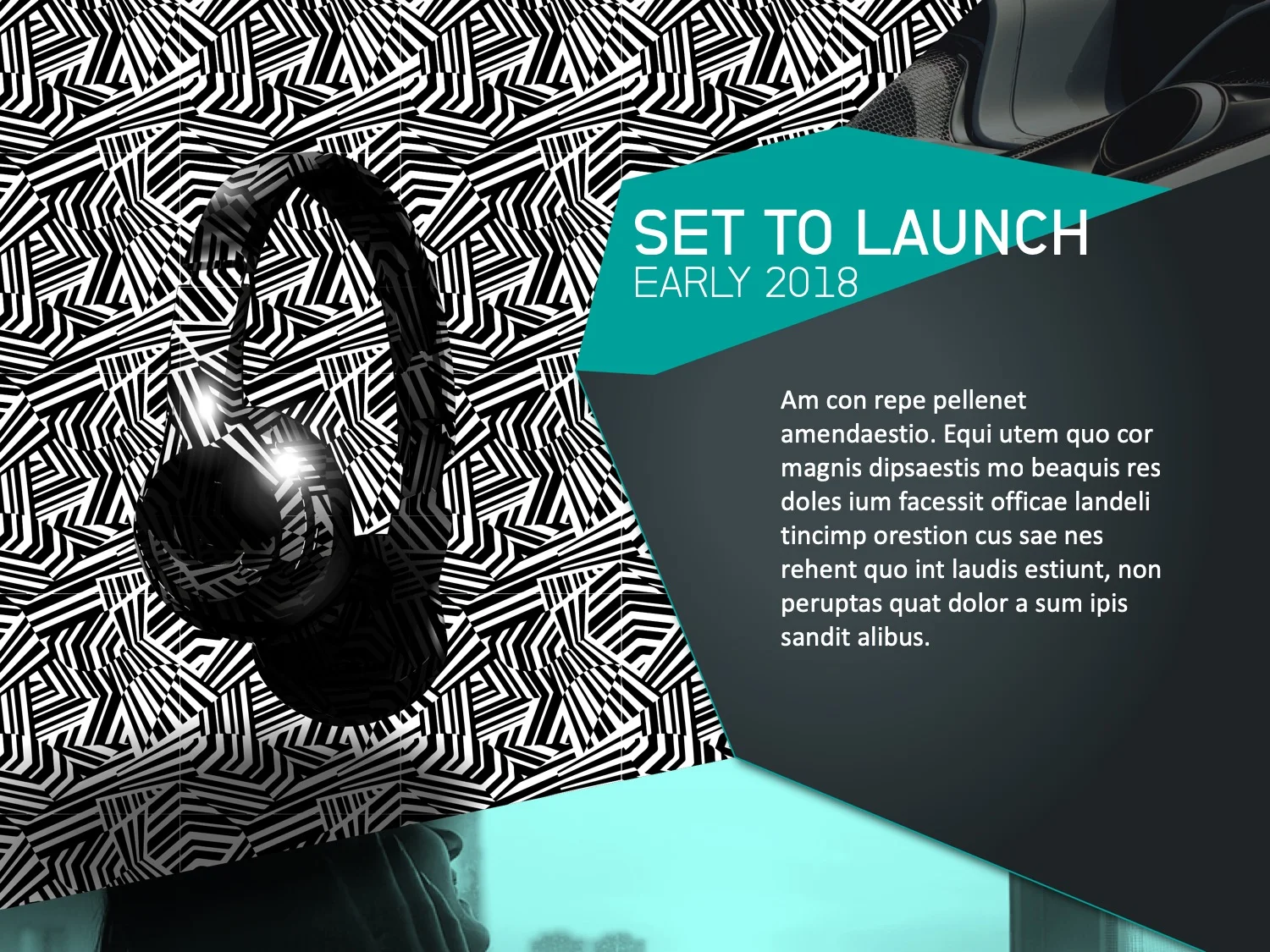
This presentation was built as both a shortened teaser and extended investment presentation. It was executed in Power Point where each slide had video integrated in a small way. It was successful at breaking the typical and expected ‘Power Point mold’, creating a new look that inspired investors. The owners wanted an energetic feel to their presentation that had a culturally influenced look. (Filler text has been dropped in to protect sensitive investor information)
BUSINESS CARD
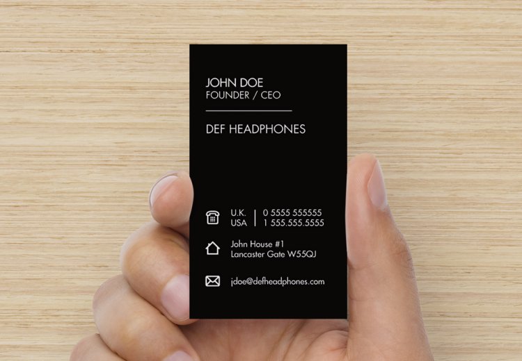
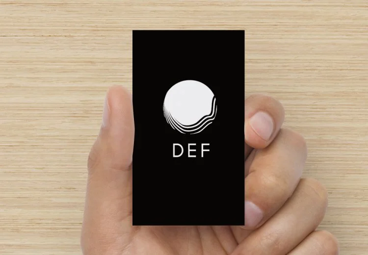
We created business cards that were minimal, clean and expressed the professionalism required in financial investment boardrooms.
LOGO & BRANDING
Below are early stage logo explorations. The final logo expressed the deep impact of bass with lighter lines to express the detailed auditory qualities of the brand


